PROJECT - Website Redesign
GOAL - Create a simple, clear and engaging customer journey
CLIENT - Sydney Based Italian Restaurant - Food & Beverage Industry
MY ROLE - User Research; Information Architecture; UI Design
TOOLS - Figma, Adobe Photoshop, Adobe Illustrator
USE CASE SCENARIO
Italian restaurant opened during the 2020 Pandemic. Their current website requires a fresh look in order to attract more viewers and enhance the user engagements.
Original Website
DISCOVERY
Tested the current design with a group of five users. The results along with the research on top-three competitor websites revealed that poor information architecture and ambiguous site navigation are the main cause of complicated customer journey.
APPROACH
LANDING PAGE
As best said by Will Rogers "You never get a second chance to make a first impression".
With that in mind and considering modern days' time-poor users, major components of this website are made available to the user in a brief and carefully organized manner at the start.
NAVIGATION BAR
Extensive research lead the decision of limiting the Navigation Bar to maximum of four elements, Home, Menu, Bookings, Contacts. Although the business is relevantly new and there are room for extension.
MENU
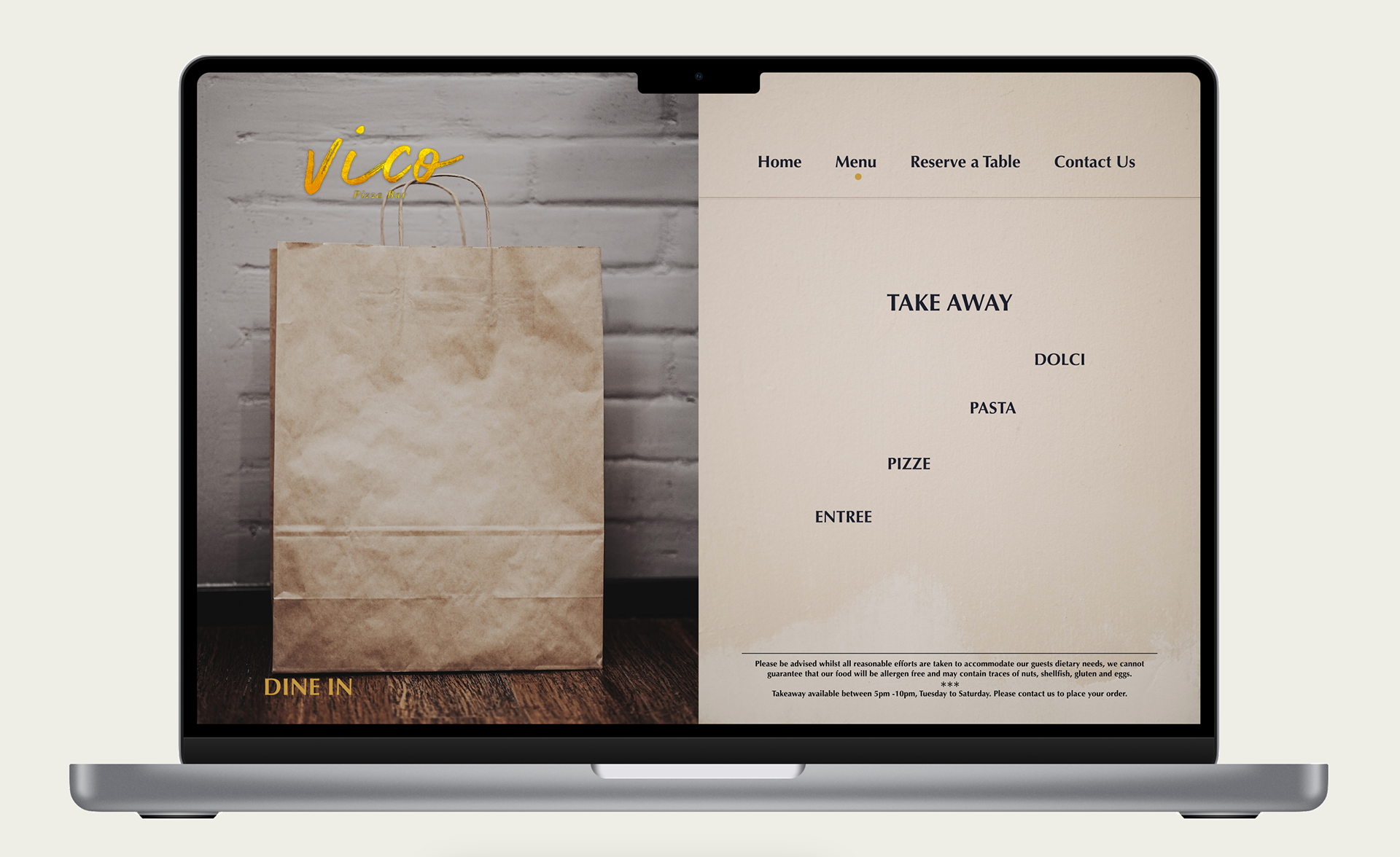
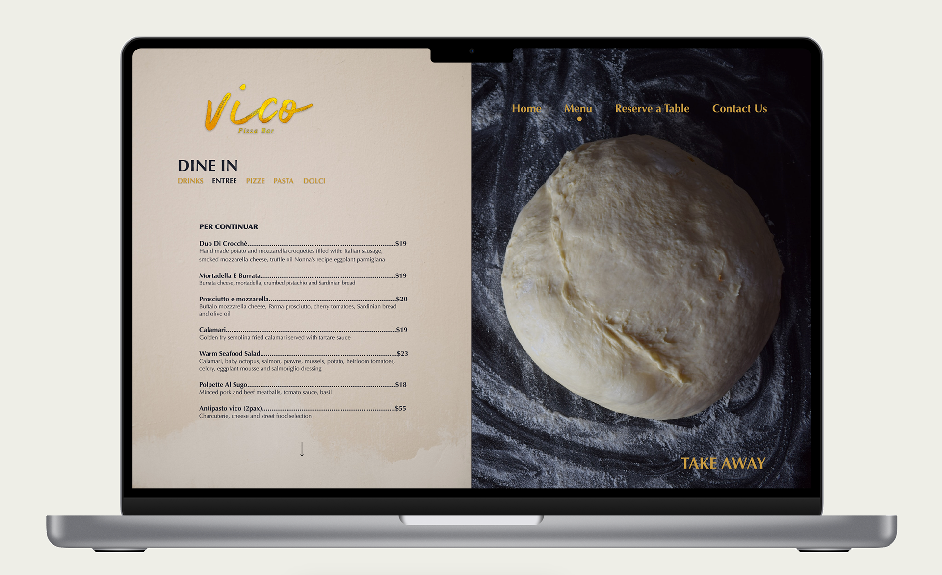
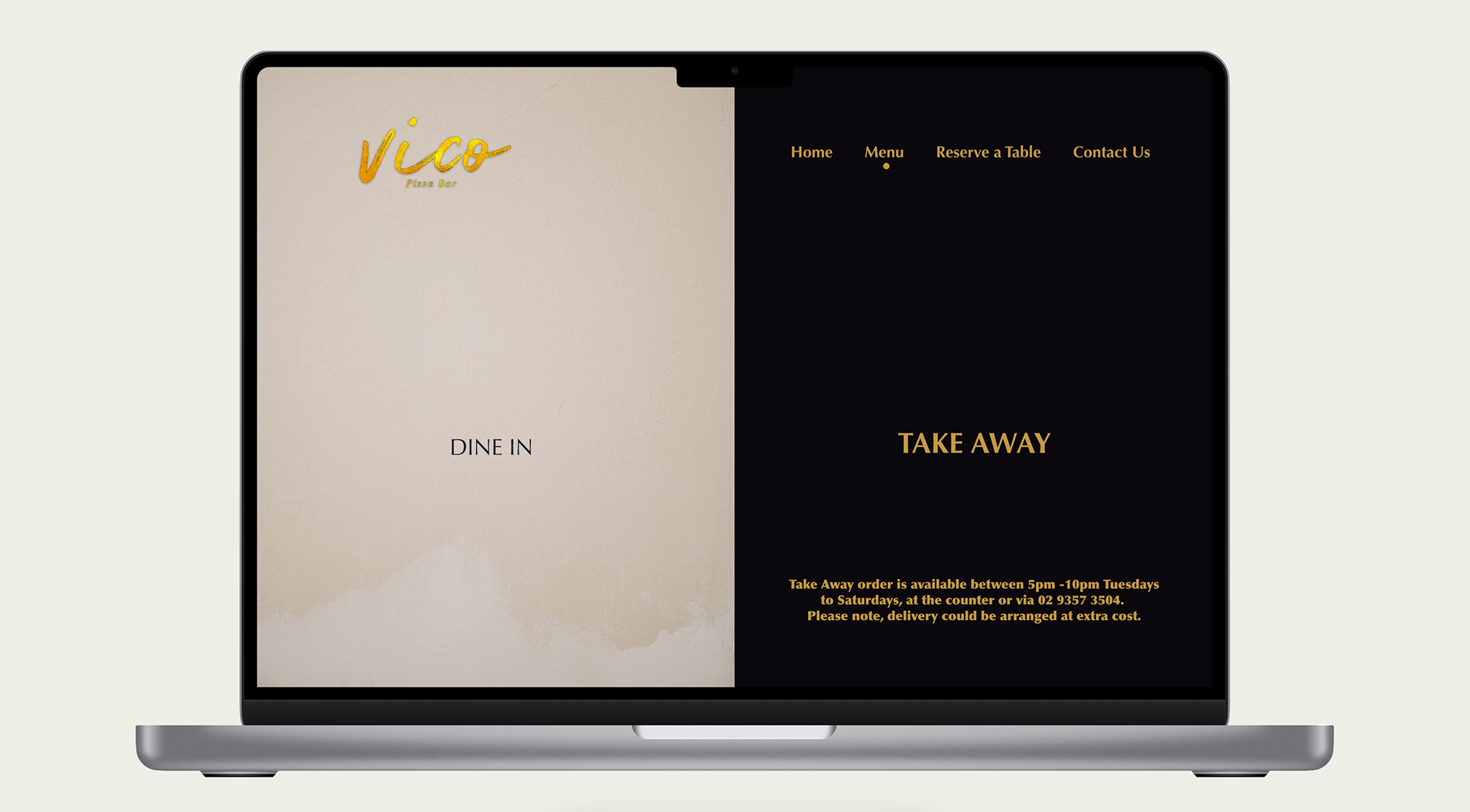
Eliminated the confusion of inconsistent data presentation by placing the "Dine-in" and "Take Away" menus under one umbrella. Each category is linked to the other that allows alternating between the two quickly and smoothly.
In addition replaced downloadable PDFs and endless scrolls with interactive visual elements to create engaging and responsive Menus.

Dine-In Menu

Take Away Menu

Dine-In Menu

RESERVE A TABLE
After Menu, Reservations is the most important feature of this website and can heavily affect user's experience. The full focus here was to create a friendly and interactive booking experience. User receives feedback on almost every step along the process and is offered to move back and forth between dates/time freely.
CONTACTS
A simple animated map delivers the location and distance to public transport plus it is linked directly to the Google Maps to save user the extra step of typing the address in a browser or map apps.
PROJECT constraints
This restaurant opened in the middle of 2020 Pandemic therefore it would be fair to assume "budget" be one of the major constraints. Hence the emphasis was to keep the design as close to the original but leave room for future extensions.
MAJOR USER NEEDS
Quick and easy access to the information and providing visual feedback while interacting with the website.
FUTURE IMPROVEMENTSAn Online Order feature is an excellent addition to this website although it will introduce extra cost on the business, such as enough staff to prepare and pack the orders and arrange the pick ups, the e-commerce feature will impose operating costs. The other challenging decision would be to offer a delivery or team-up with major delivery companies.
FINAL LOOK
THANK YOU!

