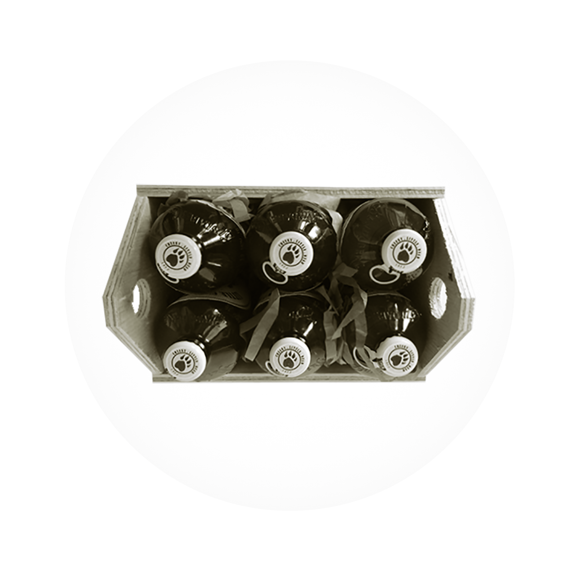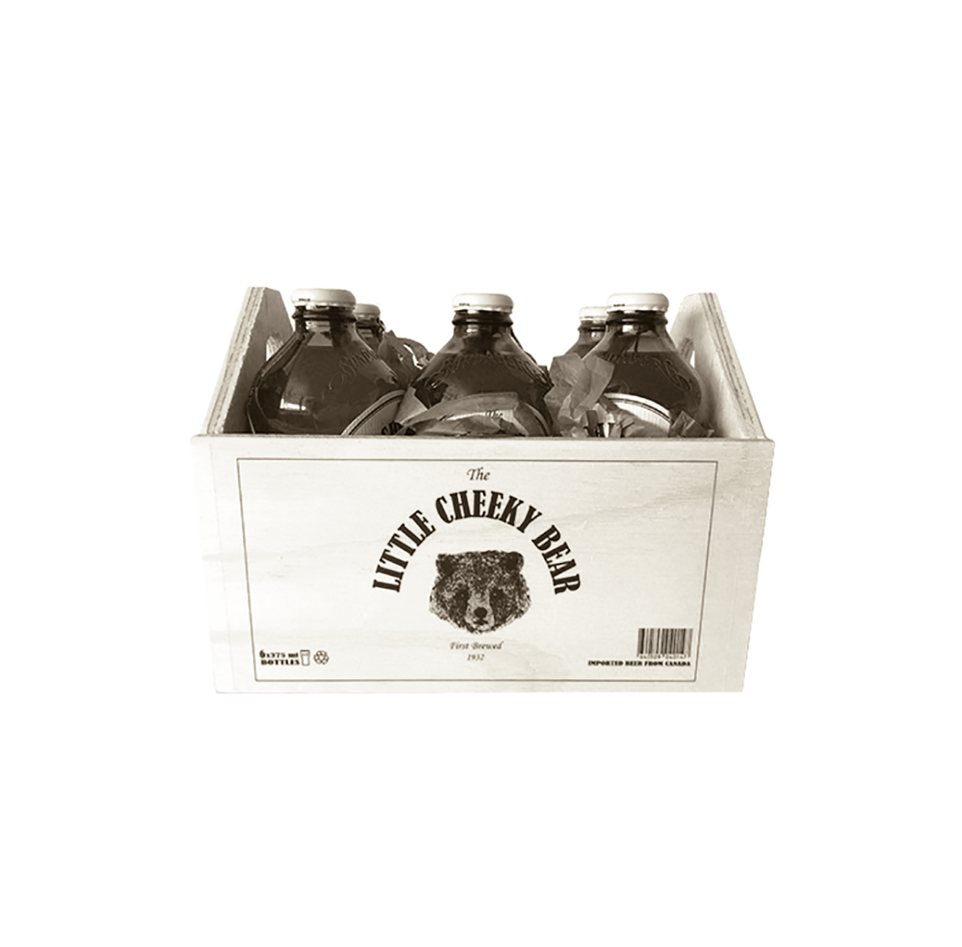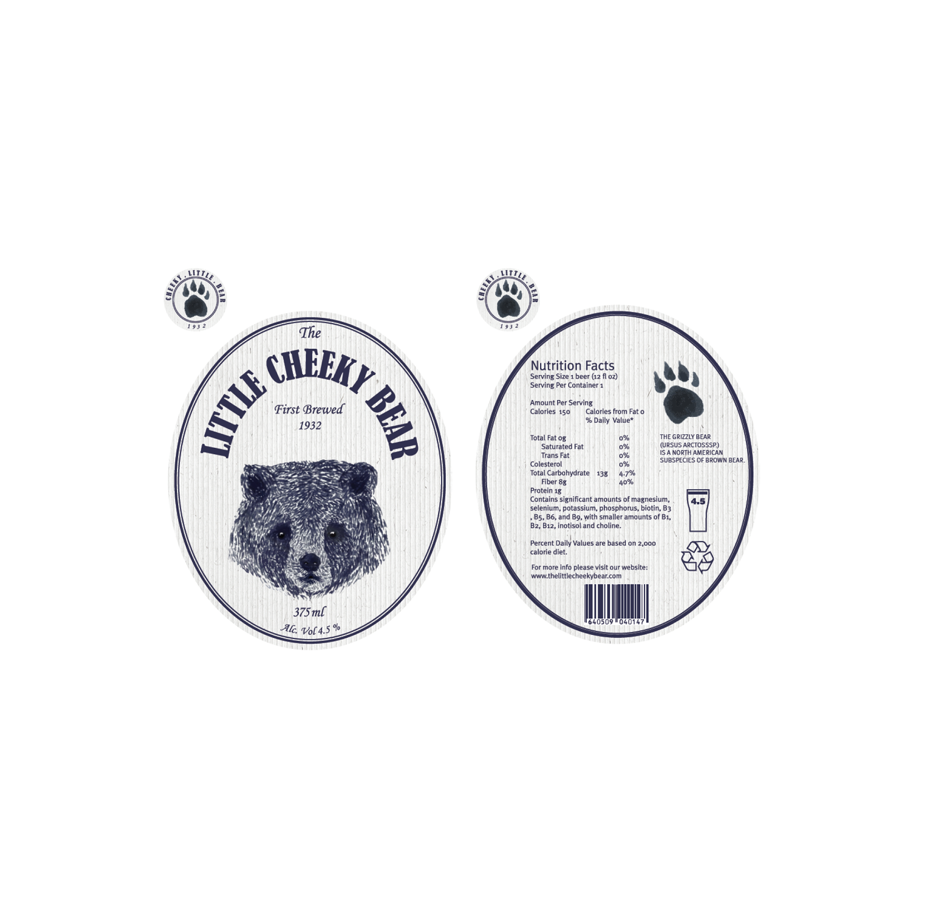
PROJECT: Branding for a Canadian Beer Brewery
TYPE: Branding
APPROACH:
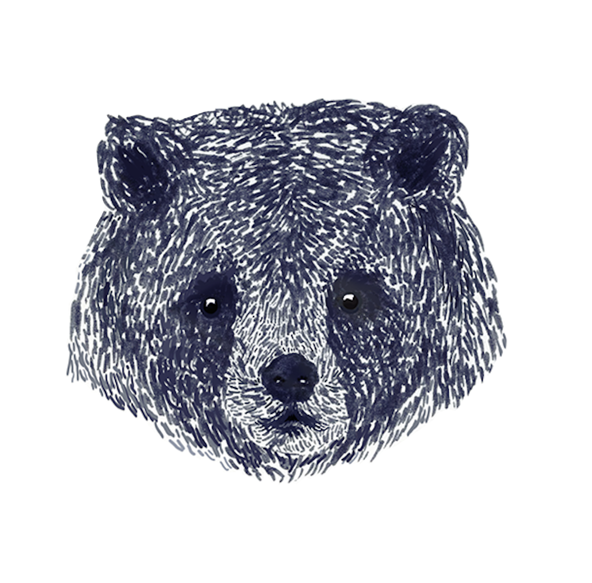
The whole design evolved around an illustration of a Grizzly bear as the company is located in North America. The purpose of bold serif font is to add emphasis on brands vintage look, widely used in old tavern signs and logos.
TOOLS: Adobe Photoshop, Adobe InDesign, Paper & Marker